EQUAL VALUE COMPARISON
The objective of this study is to help students improve their perception of lightness and darkness in color and to cultivate their perception of hue within a close value range.
Our visual perception functions utilizing comparison. Color effects are intensified or weakened by contrast. There are several kinds of color contrasts. In this study, we examine value contrasts or contrasts in lightness or luminosity. Value, with color as well as with achromatic grays, is the degree of lightness or darkness.
VALUE CONTRAST STUDIES
The objective of this study is to help students utilize the differences in color to create a unified composition. This helps them understand how different colors behave within the same field of view. In visual perception of the real world, contrast is determined by the difference in the color and brightness of the object and other objects within the same field of view.
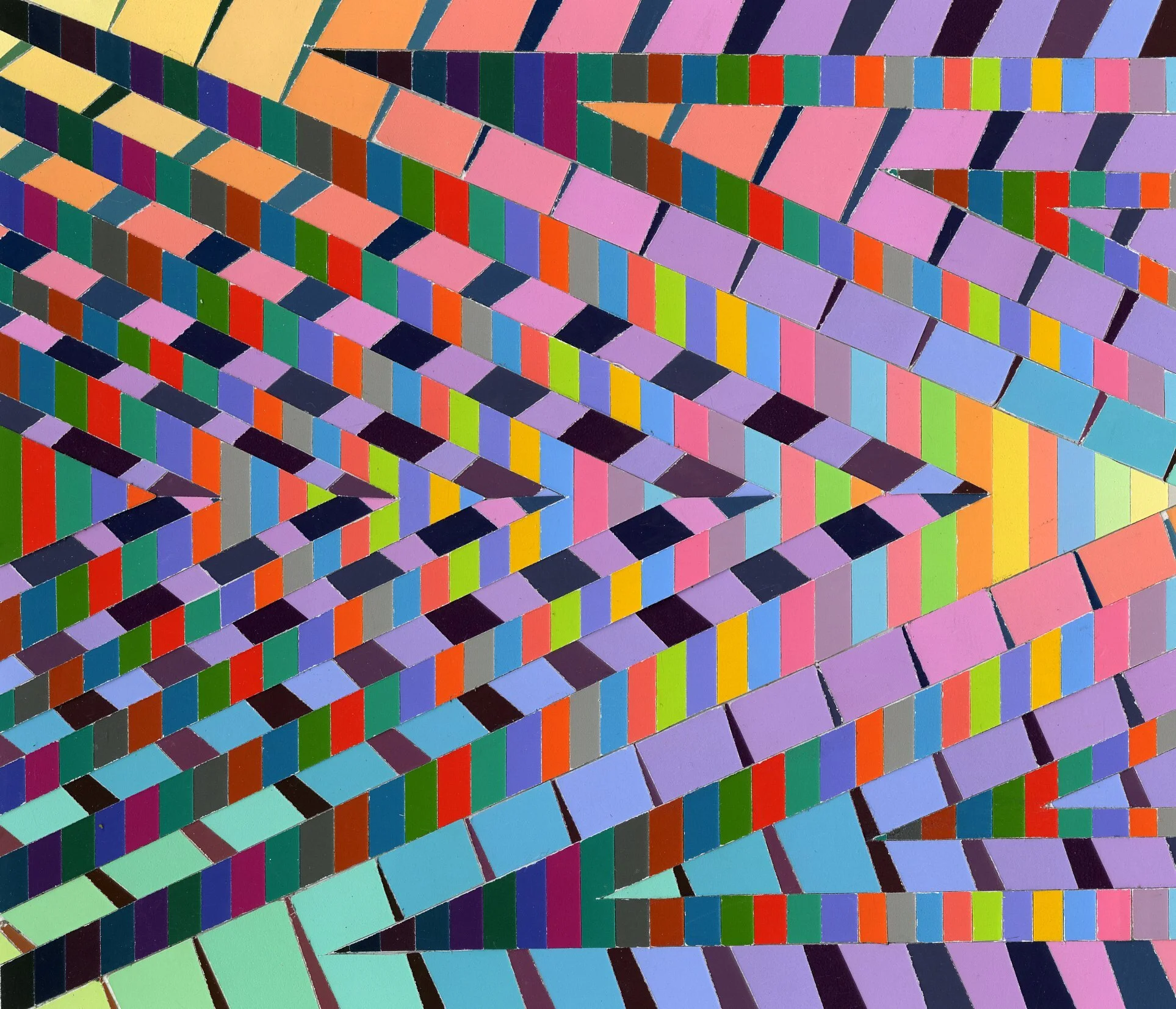
Students create three or more stripe studies with color aid paper, each exploring a different way of sequencing and grouping the stripes according to value. The progression structures are then cut and arranged in their inventive way to achieve an interesting composition.
PYRAMID TRANSFORMATION
Color has the ability to change the appearance of objects by light and shadow. For this project, students begin by making studies of possible new forms that can distort the appearance of a 3D pyramid. They then use color and design to change the appearance of the 3D pyramid.
ANALYSIS OF MASTERWORK
Students chose master work from the nineteenth and twentieth century paintings. They translated their chosen master painting into a series vertical stripes of various colors and widths. They started by assessing what colors are present in the work and making a list using swatches of Color-aid.. This analytical study focuses on proportion, proximity, distribution and paint handling.
COLOR AS SIMILE
Often color’s role is to provide similarities, to evoke things that are not represented. Color can act as a simile by drawing associations with various aspects of human life and various environments, from both the man-made and natural worlds. These associations, in turn, communicate meaning, not necessarily singular and literal meaning, but meaning that gains power through its ambiguity. Though the associations that color draws, the reminiscence it inspires, we can communicate ideas, feelings, values, and attitudes.
To begin this project, students focus on a single color and then consider how different this color can be experienced depending on its context. To help them ponder the difference a context can make, they propose a conceptual dichotomy with which to focus their work. Their task is to suggest two different conceptual identities for their color by changing its context and thus changing how we experience and perceive it.
The first work explores innocence vs decadent using yellow as the primary color. The second work explores dream vs reality using orange as the primary color.


